

Showing posts with label typography. Show all posts
Showing posts with label typography. Show all posts
Friday, September 6, 2013
Painted Skull
Thera Hillis, from Chandler, Arizona, painted this skull. The words on the painting are from HIM's "Sweet Pandemonium". I've never familiarized myself with the band, until today. They have melodic and dark themes, which fit well paired with the skull. It's interesting to see how people connect to music, through their art and other aspects of their life.

Wednesday, February 22, 2012
Designed Skulls
Stephen Brandt from Richmond, VA sent us a pair of designer skulls,
Stephen first wrote: “Here's a still from the animated film ‘Lasagna Dish’ that I did showing off the piggy skull wallpaper I designed for the background. If you would like to see it for yourself, viewers can see the skulls in action HERE.”

Stephen also shared a collection of arranged type skulls with us.

One C says:
Your short film that featured the wallpaper is hilarious, you have a wonderful story telling style, yes I watched them all. Also thank you for your arranged type. It has been interesting to see over the years how artists work type into more traditional logographs. Thank you for sharing these wonderful works with us to share, and I will be looking out for your next video installment.
Friday, September 10, 2010
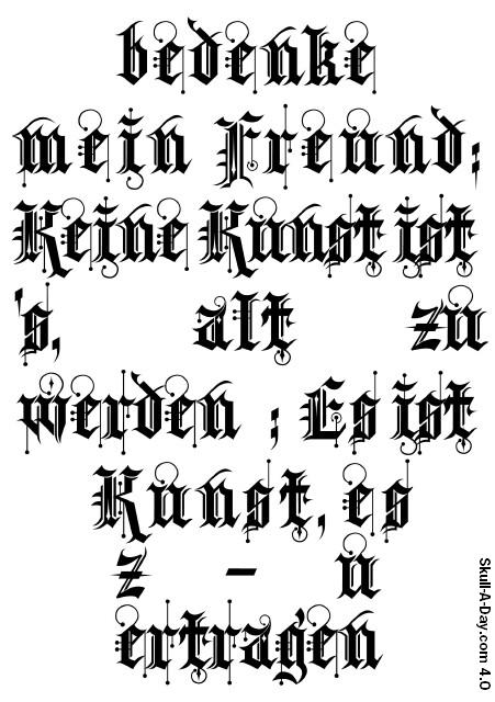
Typographic Skull
Jess told us: “I was creating a birthday card for my friend with a layout program. While formatting the text, I was experimenting and hit the 'justification' in type-settings: Surprise! A skull appeared. I have been a skull-addicted for a long time, and was inspired by your blog. So I decided to format that skull a bit further and more clear.
The text is by Johan Wolfgang Goethe (German philosopher): ‘Keine Kunst ist's, alt zu werden; Es ist Kunst, es zu ertragen.’ Translation: It needs no art to age; but to bear it, is an art.”
 Alternative Version on suggestion from the Skullmaster.
 As an added bonus, Jess has kindly shared a pdf version of these works in postcard form for you to download from here. (The Creative Commons License is at the bottom of the right sidebar.)
Enlightened C says:
I am a big fan of picture typography. I really am awestruck by this piece. This worked is packed with so much symbolism that one can easily view it though the multi-facets that Goethe himself might have done. Thank you for sharing this piece with us, both the original. and the alternative version. This truly is a wonderful birthday gift for anyone who loves skulls or just art in general.
The text is by Johan Wolfgang Goethe (German philosopher): ‘Keine Kunst ist's, alt zu werden; Es ist Kunst, es zu ertragen.’ Translation: It needs no art to age; but to bear it, is an art.”
Original Version
 Alternative Version on suggestion from the Skullmaster.
 As an added bonus, Jess has kindly shared a pdf version of these works in postcard form for you to download from here. (The Creative Commons License is at the bottom of the right sidebar.)
Enlightened C says:
I am a big fan of picture typography. I really am awestruck by this piece. This worked is packed with so much symbolism that one can easily view it though the multi-facets that Goethe himself might have done. Thank you for sharing this piece with us, both the original. and the alternative version. This truly is a wonderful birthday gift for anyone who loves skulls or just art in general.
Wednesday, January 20, 2010
“7sins Skull”
It appears I have another theme building this week . Joby Cummings, who pushes ink at Freak Chic in Los Angeles, CA submitted this “7sins Skull” piece to us.

Absolution C says:
This is an incredible piece. I was so taken in the beautiful flowing lines, that I forgot about the meaning behind them. Thank you for submitting this piece to us and many well wishes on your new exhibit.**
** If you happen to be in the LA area, Joby has work being exhibited at EM & Co from January 21-February 9, 2010. You can see the announcement here.
Monday, August 10, 2009
C-Rations: 0C1010
This week's offering is Composed of the letter C

“X * X” 11" x 8.5" Century Gothic And Century Old Style letters. Arranged computer type.
Character C says:
The planets aligned perfectly for this one as you might C a pattern here. Atlast another puzzle for my buddy Tatman to work on this week. What can I say? The letter C, third letter in the alphabet, has had a profound influence on my life so it was bound to show up sooner or later. I also include a little flashback Monday for you, for more on drawing skulls with type see the Skullmaster's post from 2 years ago this week.
Remember each Monday during the 3.0 year I am posting an original skull design. My weekly offerings are nothing compared to the one-a-day massive project done by the Skullmaster in 1.0, but hopefully you will find some nourishment in these weekly offerings.
Wednesday, October 8, 2008
[FLASHBACK] 94. Skullphabet #1
In honor of my book SKULLS coming out this month, I thought it would be fun to revisit a few of the pieces from my year of skull-making that are featured in the book:
On September 5th my skull for the day was a custom typeface (in the shape of a skull!): Skullphabet #1...

Reader Mark Conahan kindly volunteered to convert it into a functional font for me and I created the rest of the characters to have a fully functional typeface. The resulting font was then put online as a FREE download HERE. perfect for all of your Halloween decorating needs!
SKULLS, the Skull-A-Day book is in store now! Ask for it at your local independent bookstore or online at places like Powell's, Amazon.com, and Barnes & Noble.
Saturday, February 2, 2008
244. Skullphabet #2

Display Capital Letterforms based on the classic Futura (Bold) Typeface. As with Skullphabet #1 if anyone wants to convert this into an actual font file I will gladly send you the original vector art for this one and then I can put the resulting file up as a free download! (Mark Conahan you get first dibs if you want to do it again!)
UPDATE: Anthony was not the only person to comment on the "G" so I revised it after looking at my original sketches and realized that I had come up with a better solution at first!
Saturday, December 22, 2007
202. Rub-On Type Skull

12pt Helvetica Rub-On Type on Board (5in x 5 in). I was surprised to find this product is still being made (and sold at craft stores), I remember it from the pre-computer days of graphic design when mechanicals were done by hand (and also as a toy in the 70s and 80s).
Tuesday, September 18, 2007
FREE Skull Font!
 Thanks to the awesome programming work by Mark Conahan the Skullphabet #1 I designed has been turned into a functional font! Download your FREE copy here (option-click for Mac* or right-click for PC and select Download or Save As):
Skullphabet #1 TrueType
Skullphabet #1 OpenType
Since some folks are having trouble, I've put up some Zip Compressed versions:
TrueType Zipped
OpenType Zipped

This work is licensed under a
Creative Commons Attribution-Share Alike 3.0 License.
Please contact me (e-mail is at bottom submissions page) if you're interested in commercial uses.
p.s. This is now available as a FREE download for Android devices as well! Go HERE for the details.
*If you're having problems with Safari try using Firefox, it's free!
Wednesday, September 5, 2007
94. Skullphabet #1

Display Capital Letterforms based on the classic Futura (Bold) Typeface. If anyone wants to convert this into an actual font file I will gladly send you the original vector art for this one and then I can put the resulting file up as a free download!
UPDATE: Reader Mark Conahan has agreed to make the Skullphabet into a font! And I'm going to add punctuation and numbers. I'll make a post it as soon as we're done. Thanks again Mark, you rock!
UPDATE: The font is now ready for download HERE!
Tuesday, August 7, 2007
65. Helvetiskull

Arranged Type. I limited myself to the letters "Skull A Day" with caps and lowers as shown and used the font family Helvetica Neue, specifically 25 Ultra Light, 35 Thin, 45 Light, and 55 Roman.
P.S. Only 300 more to go!
Subscribe to:
Posts (Atom)